Here are major the steps in making this image. Depending if I have time for it or not, I may turn this into a series:
1: The Beginning...
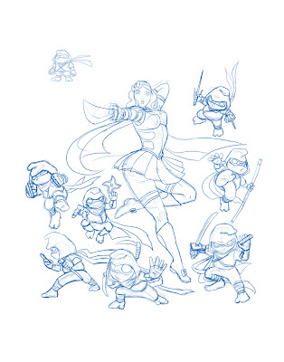 In the beginning, before I realized this project to be a major one, this was more of an idea I sketched out in Adobe Photoshop after a friend mentioned something to the effect of Snow White being an excellent name for a ninja and he gave me the title "Snow White and the Seven Deadly Dwarfs".
To me, it sounded like an awesome martial arts exploitation B-movie--my interests peaked. In response, I took that idea and decided to push it--at the time this image was sketched, it was just Snow White by her lonesome and I realized that the story of Snow White had major elements that should be illustrated as well, namely the Dwarfs, the Mirror, and of course, the Queen.
I decided to add in some Dwarfs and make the idea more legit--in this interpretation, the Dwarfs are hard working miners on the outside but under their stout frames lies the spirit of expert shadow warriors. This is where Snow White gets her ninja skills from (insert cheesy training montage sequence). Major inspiration for the Dwarfs were primarily the Teenage Mutant Ninja Turtles, one of my favorite childhood cartoons.
After sketching up to this point, my intentions were set on drawing the Vain Queen and Magic Mirror, but I another project came up and I had to put this on hiatus until I was free again to work on it.
2: Time for a Do Over!
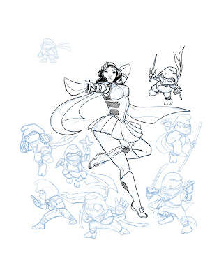 When I returned to the image, I decided that maybe it was a good time to start inking it in to see how it looked with clearer lines. While inking, I noticed that the image was relatively small--for best quality, it would have to be printed on a 4" x 5" size paper (at 300 dpi). A lot of the details I could have put into it were missed out because they just wouldn't be visible on that small a scale, so I considered making it poster size (18" x 24", at 300 dpi), but at the time I did not want to re-ink it and eventually ran into another project, so again this was left on hold.
After some time, when I agreed to help my brother participate in an anime convention (Freecon, coming up this week), he suggested I gather up some work and make prints to sell at the event. It seemed like a good enough reason to dig this back up again--and so I did, and I was comfortable enough in re-inking this for a higher resolution.
But before any inking had to be done, I needed to add in the other essential characters...
3: Revise Composition and Scale Up!
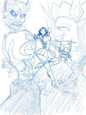 And so I did. I scaled the entire sketch up in Photoshop and decided to make things more complicated and practice using another program I have been neglecting for quite some time: Paint Tool SAI.
I haven't used SAI often, but from the times I did use it, I noticed it handled line work very well (with a nice stabilizer function and some good preset brush tips), and that's what got me to use it for this project. To warm up, I sketched the Queen and the Mirror's face until I felt comfortable with the tools and interface.
4: Inks and Flats
In utilizing SAI's stabilizer and Brush tips, I was quite satisfied with the results. I noticed a bit of lag while working on it, but that was because the file size was getting increasingly large...
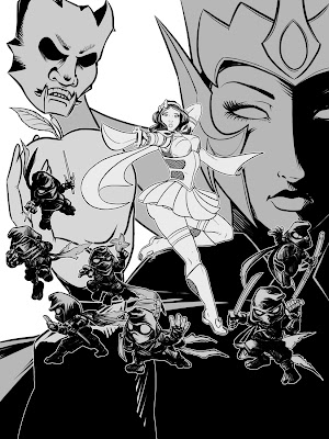
After finishing the inks, I took the file back into Photoshop and built shapes for the separate elements that needed to be colored, keeping in mind the layer order. I filled each section with a particular grayscale value to visualize the overall depth of the image and reconfigure the composition if need be:
5: Flat Base Colors
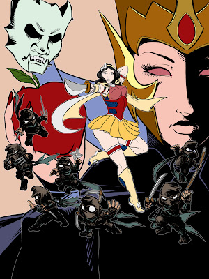 Then, adding more layers on top of that, I built shapes to block out areas of colors, filling them with a base color to better illustrate the color scheme of each character and to sort out which colors I wanted to subdue and emphasize.
From here, I decided to get out of Photoshop and focus on another program: Corel Painter. Painter is is good at what it does, even though the program may be unstable at times. I wanted a subtle painterly look for the colors, and Painter's acrylic brushes produce a nice result, mixing colors like real paint--so I opted for that.
6: Painting!
As the growing file size created issues with long load times and crashing Painter, I enacted on a work-around. I knew I was only going to focus on one element at a time, and each element had numerous layers for color, so I split each element/character into their own file and painted each separately--once again, keeping in mind the layer order.
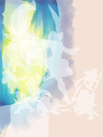
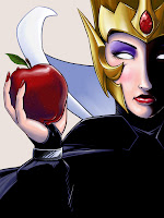
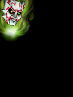
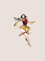
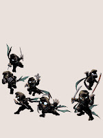
Each section was treated somewhat differently, but I tried to keep a consistency by mostly using the acrylic and airbrush brushes. I was aware that some parts I worked on may be covered up or not even be seen, but I painted them in whole anyway, just in case I had to move things around for composition's sake--that would save me time on having to repaint if I left a gap or hole in a certain areas.
7: Compositing and Tweaking
After all the sections were painted, they were ready to be pieced back together into one file again--further increasing the file size.
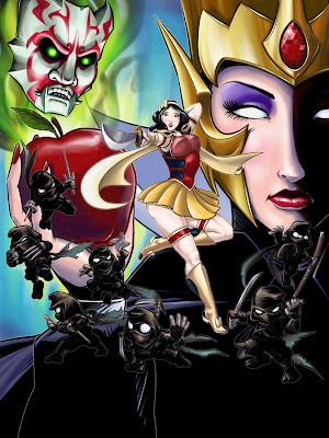 I made some tweaks in between to make sure everything showed up properly in Photoshop, a major one being the fire around the Mirror's face. Other than that, this is just a straight out composition of all the fully-painted elements. Even though it's painted, it still looks very flat and all mashed together into one big chaotic blob of colored stuff.
8: Emphasizing Unity and Harmony
To separate specific layers away from others and create an illusion of depth, I added some fog-like dabs with a custom brush and leveled it out to make the image have some form of atmosphere. I further increased the visual depth by slightly desaturating certain areas (using Adjustment layers) and applying solid colored gradients to flatten areas that popped too far out.
Now things are becoming less flat:
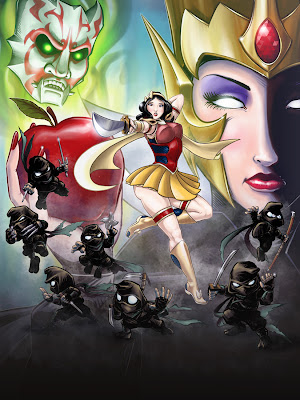 Knocking things things back by desaturating or covering them up works very nice, but I wouldn't be ready to call this image done yet--After looking at the composition for a while, I saw that it was suffering some areas of negative-space gap and needed to be filled with something (possibly something with colors that balance out all the existing colors...)
Of course, Snow White should always be surrounded by nature because she's just awesome like that, so I had to make a bunch of colorful animals to compliment all that black I used up in inking. I also realized I had planned to draw the edge of the mirror but left it out by accident...
9: Details, Details!
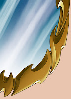
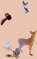
And so the mirror (though not completely seen in the image) and the animals were drawn and colored--similar process as the other portions, but all done in Photoshop this time. Adding extra details, as long as it's not too much that it has to be called clutter, can really harmonize the image and pull everything together.
Even though it came off more as an after thought, I did brew on the idea of making the image look like a corny B-Movie poster with a title logo and text--the different logos and text I experimented with really took away from the image and didn't seem the least bit interesting, so I opted to drop that idea--especially after seeing the evolution of the image, it didn't quite look like a B-movie poster...
But I still persisted on the title logo, only because I have to make it dead obvious to what gave me the idea for this image in the first place. I failed a couple times in making a proper title logo using fonts and shapes that just didn't fit to what I was looking for--so, I spent some time building an actual logo from scratch. Building the shapes, I had a flat representation of what I was going for:

Even though I probably wasn't thinking it early on, I eventually came to realize I was parodying Disney's version of Snow White. I mean, most of the reference and inspirational material I was using came from the images from the film! It's been a while since I watched it, so I don't remember much besides the essentials. However, running off that parody, I stylized the text to appear similar to Walt Disney's signature logo and combined it with the cheese that makes a B-movie title. In essence though, I wanted a heavy-stroked look to the text and the Disney logo matched up pretty well.
And that looked way out of place for the image--it needed some dimension--something a movie poster would actually have. So, with only the power of Photoshop's Layer Style effects and a couple sleepless hours later...

This.
And I really like how it turned out. It took some time tweaking, though it was worth it (mainly because I don't use layer styles often so I was trying to reacquaint myself with the way it works). It still looks a bit out of place in comparison to the rest of the image--though looking back on it now, I should have used it as reference and just painted the rest out to match the overall style of the piece... (that can wait another time!)
As with the trouble with the text prior, anywhere I put the logo just seemed out of place and very distracting. So I put it in the most practical way you can put a title--small and on the bottom of the image. That way, the viewer can look at all the hard work first before ending up at the very bottom and reading the actual title and feeling accomplished for actually having context and realizing it was one big joke. And then they laugh.
There. Problem solved.
10: Last Additions, Final Touches, and Completion!
After compositing the last pieces into the image, I made some minor tweaks to make the image read better, such as moving a part of Snow White's scarf down a bit because it was pointing at an awkward area and I needed to make room for the birds. Next, I put a light vignette to border out the edges and corners and focus on what's important: the title character--and vignettes just look cool. I also applied an Adjustment Layer to push back the Blues and Cyans and bring forward the Reds and Magentas very slightly and, above all that, I applied a Photo Filter with a warming preset to make the image flush with more orange and appear warmer overall.
Once all the final touch-ups were finalized, I flattened all the layers (which took quite a while for a file so huge--909 MB!). And to get rid of the computer-perfect rendition, I softened the blacks by lightening the image by about 2% and applied subtle Noise over the entire image to give it a more textured feel.
And here is the final image:
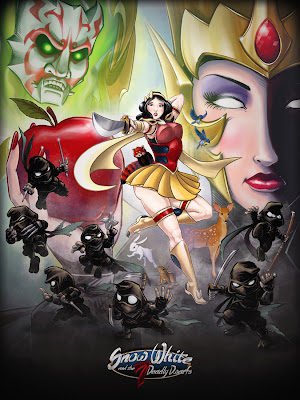
I might not be able to have it printed in actual poster size as intended since I lack the tools and material for that, but the actual final image does have potential to be printed in that size without loss of quality. For the convention at least, I will be selling a limited amount and will probably be on letter-sized sheets (8_1/2" x 11").
In conclusion, this was a great project to do and I may to do more of this in the future--I definitely encourage others interested to at least try something like this, if they haven't done so before, and hopefully this post was helpful or at least inspiring in one way or another. Thank you for reading!
(Apologies for any typos you may find.)
No comments:
Post a Comment